Bright Blooms Counseling
Logo
Visual Identity
THE ASK
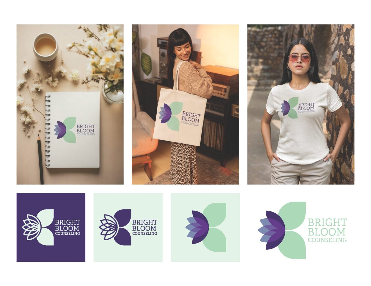
My client, Brittany, approached us to create a logo for her new therapy practice, Bright Bloom Counseling. While the practice serves anyone seeking mental health help, the primary focus is on women, particularly those who have experienced child loss, are post- or peri-menopausal, or are navigating post-pregnancy challenges.
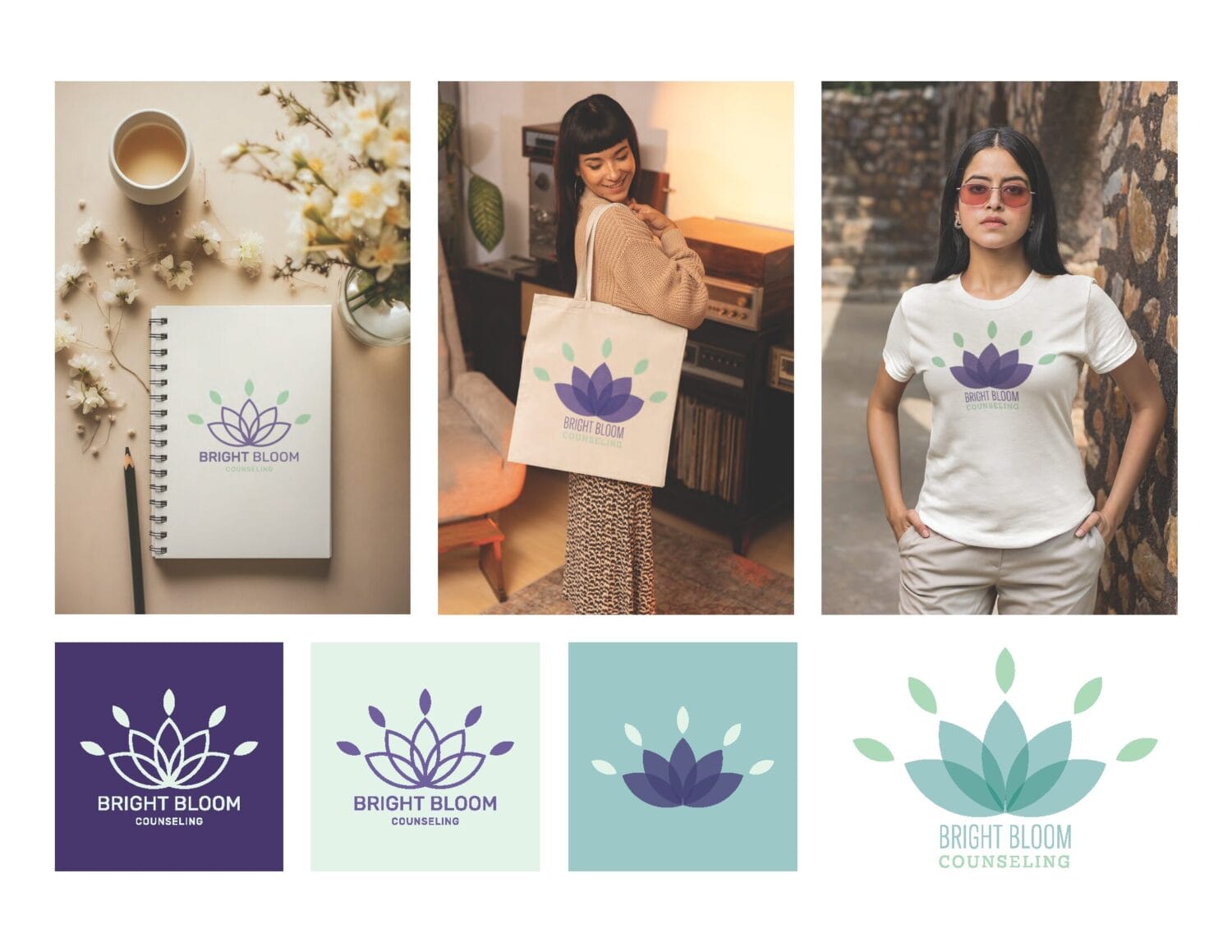
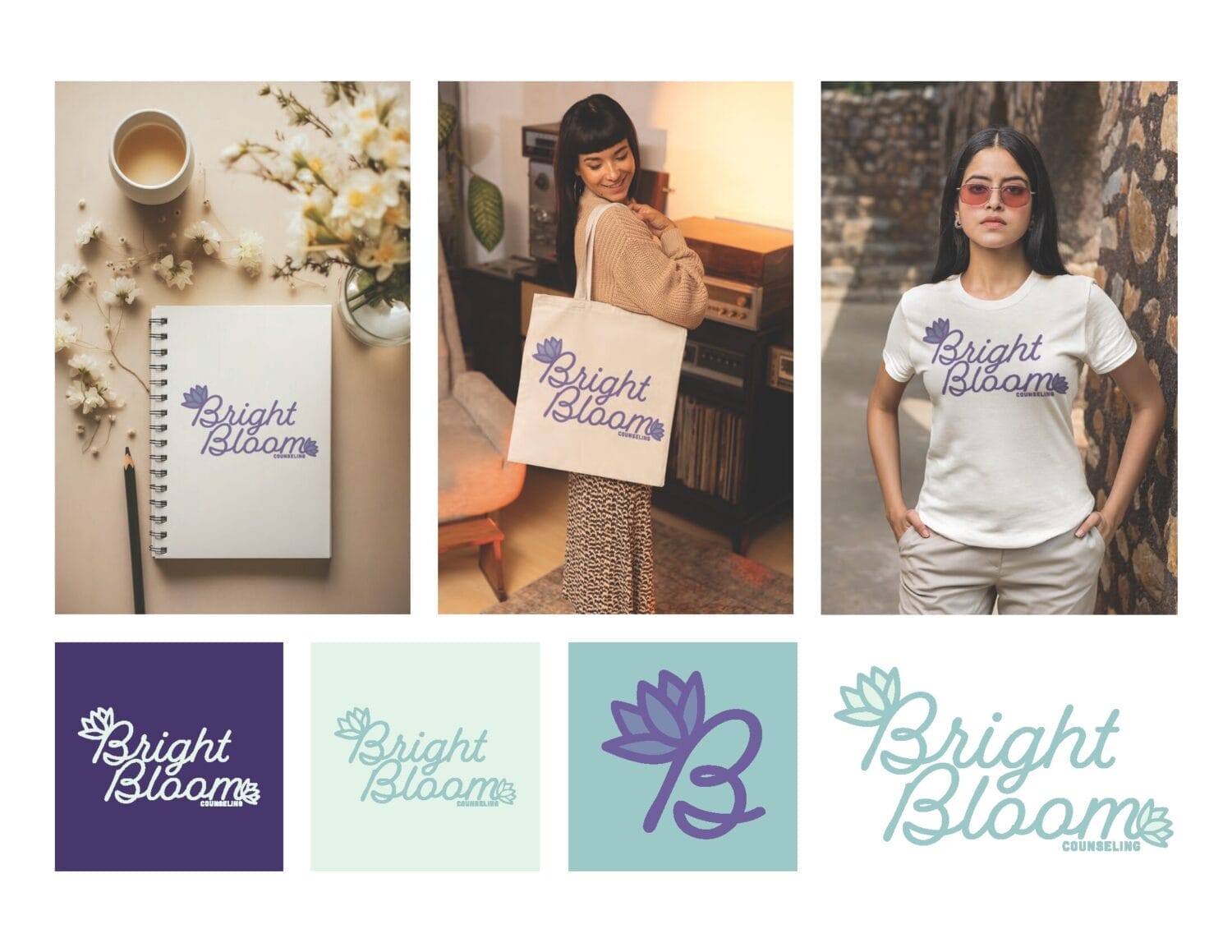
The goal was to develop a logo centered around a lotus motif, symbolizing growth and resilience, as lotus flowers bloom beautifully even in harsh conditions. Brittany wanted the logo to be professional yet approachable, aiming for it to evoke a sense of relief and comfort when people think of Bright Bloom Counseling.
THE how
To get started, we began by examining the shape and appearance of a lotus flower. For our graphic design friends, you know that the lotus is a popular choice for stock logos because of its symmetry. Plus, about 90% of yoga studios already use a lotus motif. Our challenge was to find unique ways to incorporate other elements, specifically the stalks and lily pads that often accompany lotus flowers.
THE RESULTS
Bright Bloom Counseling has been officially launched for a couple of weeks now, and our client, Brittany, is thrilled with the work we produced.


Final Logo
The client informed us that choosing a final design was incredibly difficult because each option had its merits. After a few minor tweaks, primarily incorporating the leaf element and making the text bolder, we finalized the logo.
Upon delivery, we provided several versions for added flexibility: a sub-logo mark, a text-only mark, a three-color version, a two-color version, and a single-color version.

Related Projects
You’re next
Contact us, and let’s get started on your next project.


